It’s showtime!
Le Petit Théâtre d'Oka, a small theater company, aims at helping young people with behavioral problems and an interest in the theatrical world to flourish and produce a memorable show. Branding was necessary as printed out programs were now distributed across the township.

Logo on a rolled-up paper

Challenges.
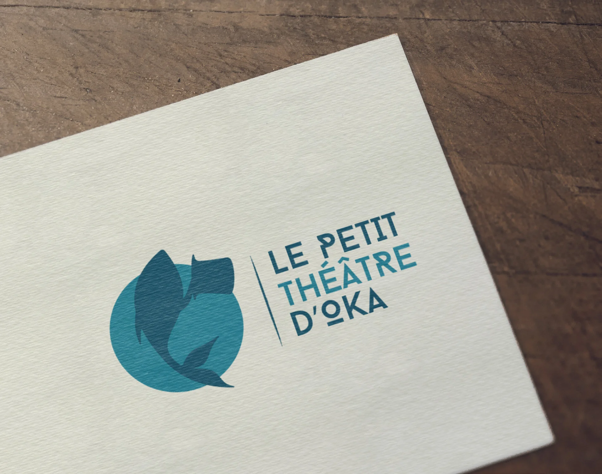
The Société des Arts et Culture d’Oka required the logo to incorporate a fish, as the municipality’s economy is centered around the fishing industry. Thus, the visual identity needed to combine the fish and theater, whilst appealing to young children. The choice of typography also needed to personify the playfulness of the company.
Outcomes.
The final logo is playful, incorporating a fish as being indicative of the municipality of Oka and its marina. The hat-tipping fish design is done using Illustrator and refers to an actor tipping his hat at the end of a show. The typography is also significant: strong, in capitals but still with several unique elements. Behind the main shape, the circle represents the light projected by a spotlight. For its part, the contrast between the shades of turquoise creates a clever visual harmony. The end product is simple, dynamic and effectively communicates the mission of Le Petit Théâtre d’Oka.

Branded T-shirt
Created with.
Adobe Illustrator, Adobe InDesign.
Material.
Digital, Paper.